Maya Thompson
Her need for simplicity guided the entry point toward the weekly routine and a clear next action, with less setup competing for attention.
ShotNest Website · Design & creative direction
I built ShotNest’s launch website and directed its AI-assisted commercial.

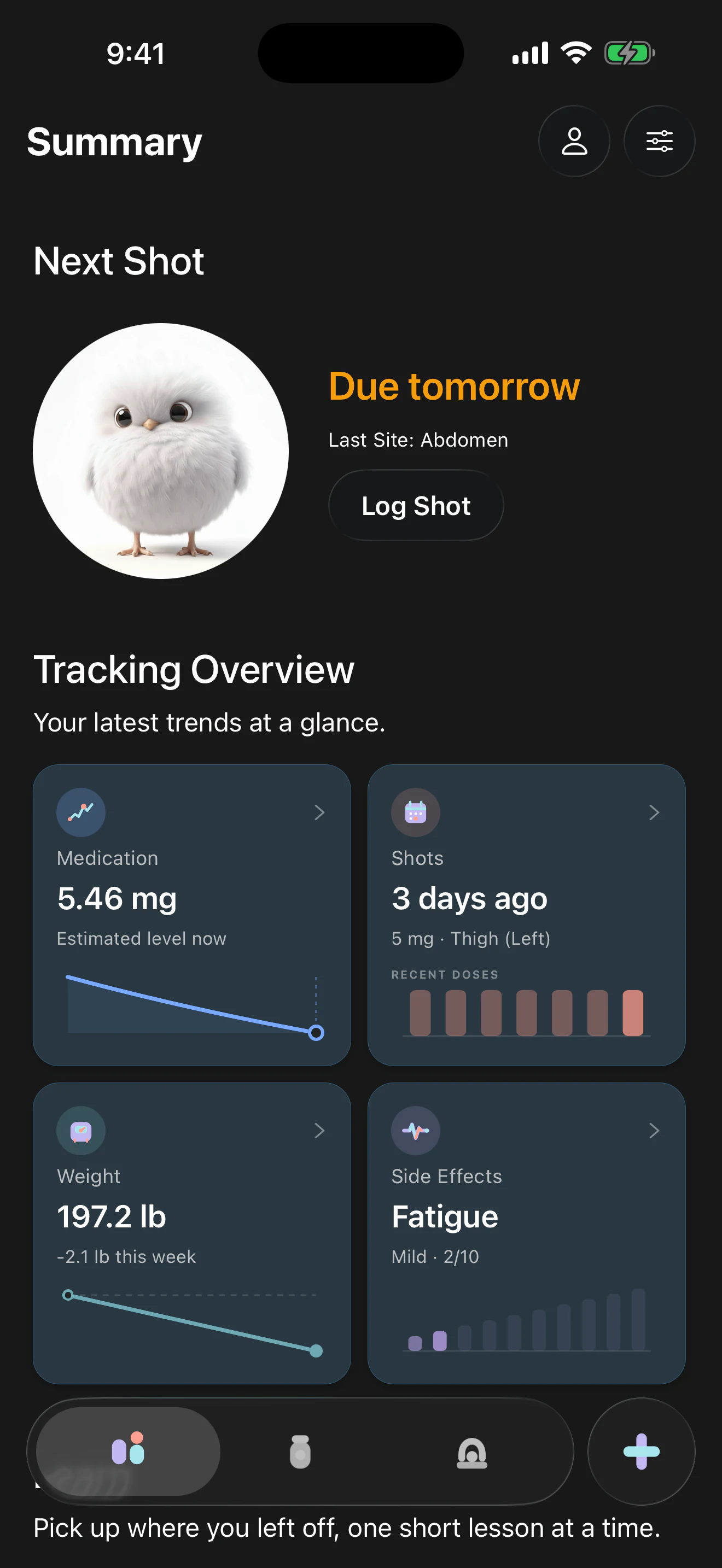
I designed the site to help people decide whether ShotNest fits their routine. They can go straight to the App Store or see how the app handles a real task: checking their next shot, reviewing supply, or following progress.
I put my reason for building ShotNest, practical guides, and privacy choices near those examples so visitors could understand what they were downloading.
Desktop homepage
I focused the website on people already managing a prescribed GLP-1 routine. The entry point needed to explain the next action, with supply, progress, and privacy available for closer inspection.
Later marketing discovery used four synthetic personas to make the audience and promise more specific. I adapted consumer context from KPMG’s 2024 Profiling the GLP-1 consumer report to ShotNest’s treatment-management questions.
The profiles, quotes, workflows, and behavior scales are constructed working hypotheses. They are separate from the original 23-person survey and are not evidence of observed customer behavior.
Her need for simplicity guided the entry point toward the weekly routine and a clear next action, with less setup competing for attention.
His need for detail kept supply, progress, and control available for a closer look, supported by clear explanations.
The provider-partner perspective placed a possible partnership model downstream of useful weekly routine management, with trust and transparent incentives as conditions to explore.
Her treatment-selection needs clarified a scope boundary: the app supports an existing prescribed routine. Treatment selection and clinical advice stay with the clinician.
Those perspectives informed a simple entry point, optional depth, and visible privacy choices. The next step is to test whether real people understand the next action, find the detail they need, and recognize the product’s limits.
I replaced selectable screenshots with recordings of checking the next shot, reviewing supply, and adding a vial. Visitors could see the sequence of actions as well as the finished interface.
The Watch preview sits beside the iPhone recording so people can see what the smaller screen offers at a glance: the active vial and remaining medication.
The original opening recording moved from shot history into a saved record, showing what people could revisit after logging a shot.
Shot history and record details in the working app.
Local records, no required account, and optional syncing needed to be understandable before download. I made those choices part of the product explanation rather than leaving them only in a policy page.
The current site uses static HTML, CSS, and JavaScript, built with Vite. I split Pollito’s artwork into layers so the pupils, head, and wings can react independently. Pollito stays still with reduced motion or without JavaScript. The animation pauses offscreen, and task recordings load as visitors approach them.
I reduced image sizes and hosted the fonts locally. In October 30 Lighthouse lab tests of the production build, the site scored 100 on desktop and 94 on simulated mobile.
I directed the concept, script, storyboard, character references, generation tests, selected takes, narration, music, and final edit. The film follows one adult woman through everyday moments; ShotNest appears when it can answer a practical routine question.
The finished 40-second V39 cut combines generated human scenes with authentic app capture and a real brand end card. It is a completed creative artifact, with no body-transformation story or clinical-outcome promise.
Final V39 cut: generated human scenes, authentic app capture, and a real brand end card.
[Music] It’s not just injection day. The details follow me. Where did I inject last time? When’s my next dose? How much medication do I have left? ShotNest keeps my routine together. So there’s a little more room for my day. ShotNest. A calmer GLP-1 routine.
Reference frames kept identity, wardrobe, light, and setting consistent. The phone-scene tests produced speech-like mouth movement, oversized smiles, and early blinks. I compared takes, refined the starting expression, and explored a phone-down action and later doorway footage when the reaction felt performed.
I kept generated phone displays hidden or unreadable. Direct app capture answered the narration’s questions with the actual interface, avoiding invented medication numbers, instructions, or behavior.
Line-by-line narration let me replace individual readings. A score intended to be instrumental contained a voice-like layer; reviewing the stems exposed it, and I removed it before refining cue timing.
I worked with AI through computer use in DaVinci Resolve to assemble and review the edit: phone-to-app timing, doorway and outdoor continuity, the stair transition, and Pollito’s end card. Earlier versions remained available for comparison.
Image generation established reference frames. Flow / Veo supplied human motion; an ElevenLabs FLUX 3 take resolved the phone tap. ElevenLabs supplied narration, Flow Music supplied the score, and Resolve assembled the film. Later improvements came from selection and editing rather than generating more material.
I shipped the download site alongside the app and redesigned its homepage after launch. I also completed the commercial shown here, built around the same weekly routine.
The earlier onboarding explorer and signup flow remain in the case study to explain how the work developed. The synthetic personas frame questions; they do not establish that the choices work for real people.
I need to learn whether visitors understand the app’s purpose, use the recordings, interpret the privacy choices, and move to the App Store. No conversion or acquisition result is claimed.

Continue exploring